
Fit4Less

Project Overview
Company: Fit4Less
Year: 2022
Scope: App
Tools: Figma
Role: UX designer UI/visual designer
Team: Self-directed
Context: Fit4Less is Canadian fitness company powered by GoodLife Fitness. The aim of this commercial gym is to be affordable therefore being accessible to all people no matter their income and level of fitness.
Motivation: The motivation for starting this project is that I currently go to one of these gyms and wondered why there wasn’t some sort of app for members and why we still had these cards to scan to enter the gym.
My goals for this project:
- Find out how people feel entering a new gym?
- Keep the solution simple yet rich enough in content for users
- Digitize the way users are members
- Offer solutions to users that improve their education on exercise and nutrition.
Through the app, I can have current users sign into the gym through an app. Using the app uses can easily learn about different exercises to keep themselves fit on regular basis and build a habit of going to the gym without feeling lost. The app will also have a way of generating profits to keep in line with how the business is run.
Constraints & Obstacles
- User’s self-interest in joining in an interview.
- Finding out the best solution to make them habituated with fitness work.
- Had to check all the competitor’s apps by myself for competitive analysis.
Research & Insights
In the first stage of design thinking, I was able talk to people who went to the gym, those who were new and those who have been there for some time for what is their thinking, feeling, attitudes, needs, and wants, and tried to understand their emotions. Hold an interview and survey them to learn more about them and their behavior & feeling.
After having structured and unstructured interviews with members of the gym and those who are thinking of joining a gym I was able to understand a bit more in regards to their demographics and their needs.
Demographics:
- Ages: 17-45
- Gender: Male and female
- Financial Status: Middle Class
Needs:
- Want to Prevent chronic diseases.
- Improve health conditions and immune system.
- Want to get fit
- Fitness challenges
- Healthy recipes
- Digital scanner for their entering gym instead of current plastic one
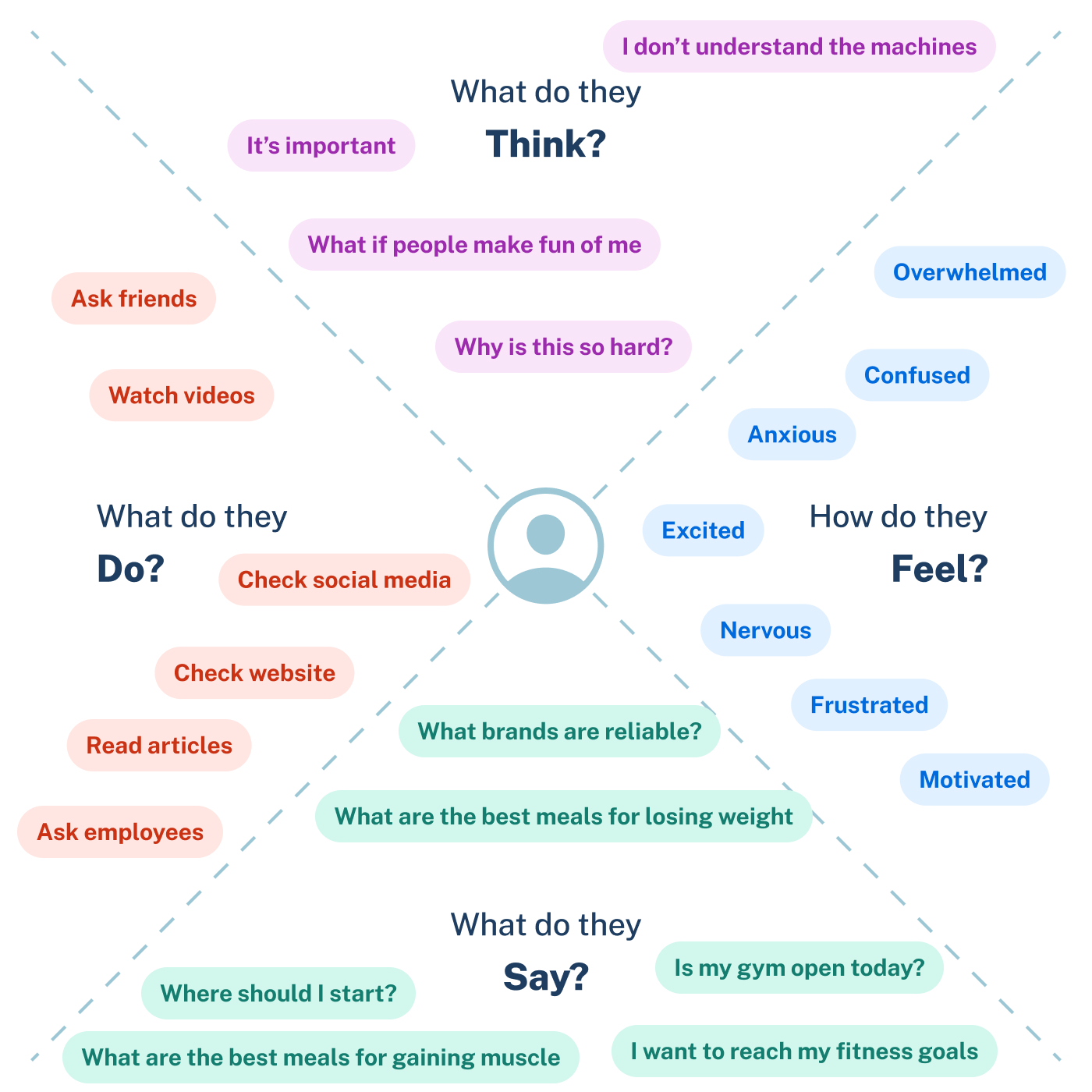
Pain points:
- Lack of confidence.
- No knowledge of healthy recipes to support their goals
- No knowledge of any kind of fitness activities and how to do them properly.
- Want's consistent updates on gym
Adding a Persona to portray a single user who stands for all to understand them better as one instead of using multiple persona.

Problem Statement:
Design the ideal platform for to educate newcomers joining the Fit4Less gym
The problem statement, also known as point of view, which I came across from the insights from user research, User persona, and Empathy mapping. To find out the solution, I synthesized the data and information I collected to define the statement.
My Offering Solutions
Users will experience the service by using a mobile app. I need to make sure that my designed digital experience is friendly, usable, desirable, credible, and accessible. The solutions I’m offering to take this commercial gym to the next level is:
- A list of exercises based on different goals and different skill levels
- A list of recipes for different dietary options
- Weekly challenges
- Updates on the gym such as important dates
Few How Might we question I brainstormed during the process:
- How might we educate new members on workouts
- How might we help users eat healthy?
- How might we help them have an easier time in accessing the gym
- How might we guide them in a proper way to fitness and exercise?
- How might we make them more consistent in fitness?
- How might we Offer them a personalized training program?
- How might we Make it more competitive for users to encourage them to do more workouts?
IDEATE
During the ideation phase before I started designing I used a method to find an validate my answer - Worst Possible Idea.
I’m the only player for it that’s why I’d chosen the worst possible idea. it’s fun generating ideas that going to support a better idea around it. Based on these I’d come up with a few worst possible ideas:
- Recommend the toughest workout challenge.
- Urge them to do workouts, fail to do that, they will lose the account.
- Make them connected with foodie people who want to leave junk food and start a fitness program.
Information Architecture

Low-Fidelity

High-Fidelity
Sign In & Forgot Password

Registration

Homepage & Settings

Fitness

Recipes & Favourites

Pop-ups

Business Objectives
A successful product is not only user-centered but also business-centered as well. It’s evident that the business model of Fit4Less is to be affordable and accessible to all. Creating this solution costs money, however it is evident that it is something that could benefit users and therefore allow it to have more market value in the commercial gym. In the market to dominate competitors I had to meet both users as well as business needs and objectives.Few business objectives behind this app:
- Add ad space that play after exercise videos to create profit.
- Use pop-ups to engage users to upgrade their current subscription right from their phone

Conclusion
Next Steps
- More usability post-launching tests to collect feedback and come up with the latest solutions.
- Gamification feature to engage users to workout more
- Solution for users to purchase products from their phone
Reflection and learning
This is a personal project, but I tried to add as much data and insight as possible. Again, my goal was to find a way to have new members enjoy their gym experience and not be nervous when starting out not knowing what do to and for current members a way to challenge themselves while in the gym. This solution still had to fit the business structure. Being an affordable gym and having a really robust app with a plethora of features would be counter-intuitive as it would cost too much to create and maintain meaning for prices for users, but if it only had select features and revenue could be made up from ads to mitigate costs. I was able to deep-dive into the different techniques to find out and provide a solution for both users and business.